The Art and Technique Of Arranging Type
The Art and Technique Of Arranging Type
Typography actually speaks louder than words. Do you really agree with that statement? Many people do not know that several high-quality designers aren’t aware of the roles and values of typography in designs. In graphics and web designs, there are several words used to portray brand identities.
Apart from that, these words are also used to portray our services and numerous other things of utmost importance to our businesses. Do you want to make your brand or business appealing to customers? Are you curious about the effective ways to express your business to millions of people around the world? That’s where the power of correct and catchy typography comes into play.
It isn’t right to write “rock and roll” with cursive font just as you wouldn’t want to write “peace” in a boldfaced angular letter. If you are really determined to project your brand or business in a better way, then you shouldn’t undermine the importance of the style of each of the characters.
One thing you can do to present your brand or business better in the eyes of the audience is to look for famous brands and examine their own unique identity. Though, you might feel that these famous brands only utilize a combination of characters and texts, but you can easily recognize them through their way of using font or style formation. A typical example of these brands is Yahoo and Google.
What is Typography?
Simply put, typography refers to the art and techniques of arranging typeface. Regardless of the purpose, a typeface is functional for impact, optimum readability, and artistic statements. Quality designs make a huge difference, specifically in communication. This is because it influences the way the reader sees, reads, feels, and translates the topic that’s been discussed.
In the simplest form, typography refers to the combination of sizes, fonts, color, and spacing. In addition, it is also applied to anything that’s related to texts. Some of these include print design, web design, books, computer graphics, and so forth.
In a broader view, typography can be defined as the process of creating a virtual picture of your brand or business without the use of words and fancy fonts. However, this doesn’t imply that the use of fancy or decorative fonts is prohibited. The primary function of typography is to create a message that resonates with what your brand offers without the use of any image.
Typography doesn’t only enhance the beauty of your graphics or web design, but it also helps to catch the attention of your audience or prospective web visitors. Apart from that, it also guides your audience naturally with the use of texts only without images whatsoever.
Now, we’ll be revealing a few of the basic rules that shouldn’t undermine when it comes to typography
Rules of Typography
Read Your Given Text with Rapt Attention
Several graphics or web designers do no read the full text as provided by their respective clients. Many of them are fond of simply copying and pasting the content from the text file sent by their clients. However, if you want to create professional typography that really ignites the attention of your customers of web visitors, then you should endeavor to read the text carefully. This will go a long way in helping you generate ideas on how it can be incorporated into the website.
Show a Hierarchy
Every website should be helpful to their prospective web visitors by displaying a clear hierarchy of where they should start reading from and how to easily navigate from one page to another. Typography is an excellent way of creating a hierarchy. This is because font size and types can be easily used to define the most important among the content of your website. And yes, a design alone may be unable to help in this regard.
Select the Color that Matches Your Design
When designing, you must select a color that perfectly matches your typography. More so, it has to be easily readable and ignite the attention of your prospective web visitors. This is because the background text on your website might disappear, specifically if you’ve chosen a similar color. So, it is wise to select colors that ideally contract with your background. For instance, black text perfectly matches a white background, a light color perfectly aligns with a dark background. This will make it easily readable, thus a perfect match with your website.
Shop With Pixelo: Best Design Resources for Designers and Web Professionals
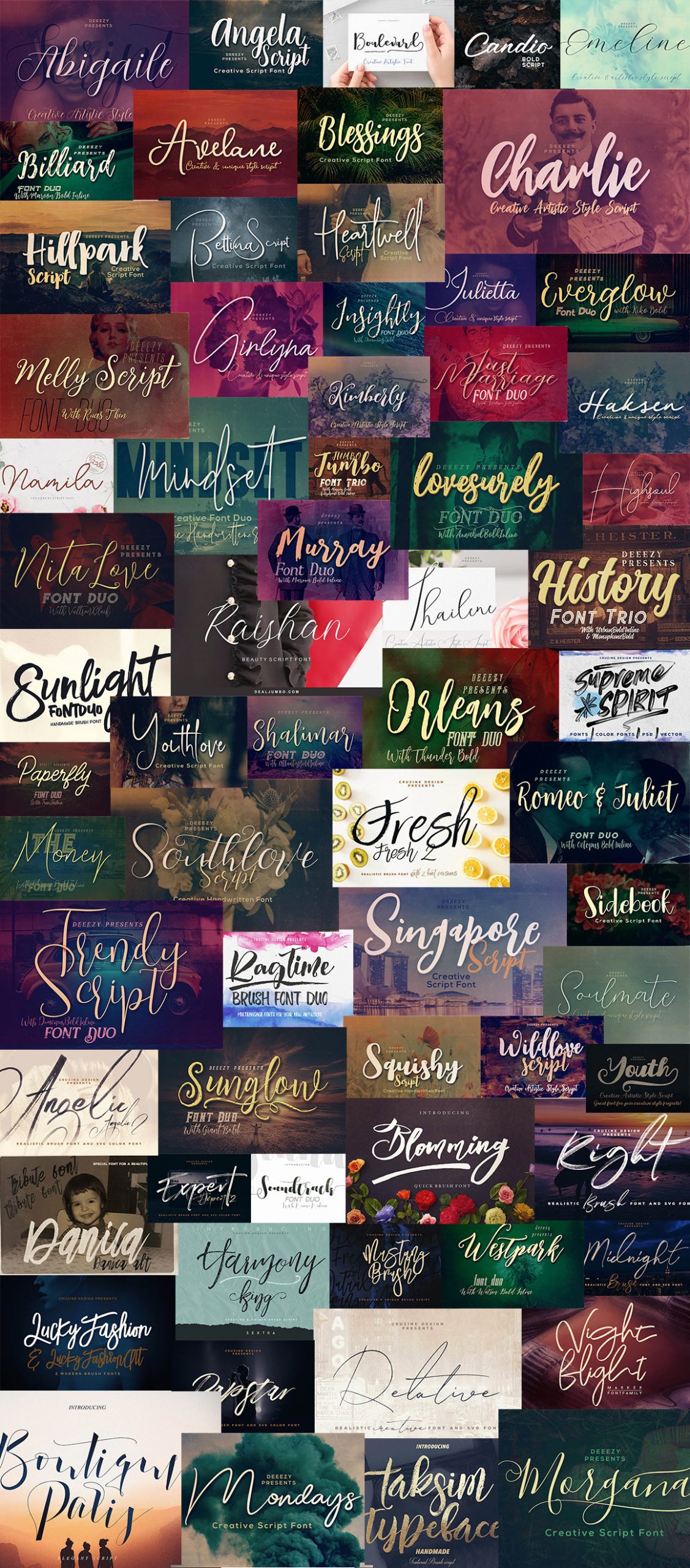
At Pixelo, we are happy to launch another mouthwatering bundle of typography for the month. And that’s the Mesmerizing Handwritten Script Fonts Bundle. Our new bundle launch comprises of 153 bundle fonts across 67 font families. Our inventory of fonts is unique and professional, a perfect recipe for your dramatic style design and artwork. To access our inventory of new typeface bundles, click here.
I like this article
Great article on typography fundamentals! The hierarchy and color contrast sections are especially valuable for designers.
I’ve been using imgenhancer.net for enhancing my design portfolio images – the upscaling and sharpening features work really well for making typography in mockups look crisp and professional. Perfect for preparing presentation images that showcase type work at its best.
Thanks for sharing these practical typography rules!
This essay offers a perspective for understanding and examining the nature of reality.
Great article on typography! Understanding these rules is essential for any designer. Speaking of creative tools, I recently discovered freevideogenerator.io – a fantastic free video generator that uses great typography in its video templates. Worth checking out for anyone who creates video content!
Solid typoraphy fundamentals! These rules apply beyond print – when creationg video content like lyric video or title cards, choosing the right typeface against a dark background can make or break the visual impact.
Really enjoyed reading on pixel77.com. The practical tips are easy to apply and genuinely useful. I am working on a related project and this perspective helped me frame things more clearly. Would love to hear what methods have worked best for others here.
Great breakdown of typography fundamentals! The point about hierarchy is especially important — it applies not just to web design but also to video content. When creating cinematic videos, typography choices for titles and captions can completely change the viewer’s experience. I’ve been exploring AI-powered video creation tools that let you pair custom text overlays with dynamic visuals, and good typography knowledge really makes the final output stand out. Thanks for this thorough guide!
I like this article
I admire your ability to convey such detailed information in an accessible way. It took me a little while to read all of the comments, but I found the article to be quite intriguing.
I found the section on kerning particularly helpful, especially the example with the “AV” pairing. I’ve always struggled to get that right, and seeing the visual breakdown makes it click. Definitely going to experiment more with tracking and leading now too!
Great article on typography fundamentals! The point about reading the text carefully before designing really resonates with me. Typography is truly an art form that can make or break a design. Thanks for sharing these valuable insights!
Excellent breakdown of typography fundamentals! The hierarchy and color matching sections are especially relevant for presentation design — the same rules that make a great webpage make a great slide deck. We’ve seen this firsthand building LivingSlide, an AI presentation tool: when the AI respects typographic hierarchy, the generated slides are immediately more readable and professional. Great resource for any designer working across mediums!
Great article on typography fundamentals! The point about reading the text carefully before designing really resonates with me. Typography is truly an art form that can make or break a design. Thanks for sharing these valuable insights!
Great article on typography fundamentals!
Really insightful post. As someone working in AI video creation, I appreciate the depth of analysis here.
Learning a lot, Thanks for sharing
Really appreciate this deep dive into typography fundamentals. The section on hierarchy is spot on — choosing the right typeface and size to guide the reader’s eye is something that translates well beyond web design. I’ve been working on video projects where text overlays and motion titles need the same careful attention to font pairing and contrast. It’s amazing how these classic typography principles remain relevant across different media formats. Thanks for the practical tips!
I really enjoyed this breakdown of typography fundamentals. The points about hierarchy and whitespace really resonated with me—clear design makes information so much easier to process. Speaking of gaining clarity from different angles, I’ve been exploring MindLens, which takes a similar approach but for life’s questions. It examines situations from seven dimensions, helping you see perspectives you might otherwise miss. Has anyone else found that both design principles and analytical tools share a common goal—making complex things more understandable?
Great breakdown of typography fundamentals! These rules are essential for any designer. As someone who uses AI tools for design feedback and typography suggestions, I keep ischatgptdown.today handy to check if ChatGPT and other AI assistants are available when I need quick design advice. Solid resource!
Interesting perspective, thanks for sharing this post. I have been testing similar puzzle/game content recently and found it helpful.
This post beautifully highlights the often-overlooked importance of typography in design. It’s fascinating how the arrangement of type can influence not just aesthetics but also user experience and communication effectiveness. I especially appreciated the discussion on hierarchy and readability—these are crucial for making content engaging and accessible. It’s surprising how many designers underestimate these principles. I’ve been exploring similar topics on my website, Banana AI, where we delve into the intersection of design and technology, including how AI can enhance typography choices. Thank you for shedding light on this essential aspect of design; it’s a reminder that great visuals are more than just pretty fonts—they’re about conveying messages clearly and effectively!
Great breakdown of typography rules! Understanding kerning, leading, and hierarchy is so crucial for any design project. This guide covers the fundamentals really well — especially the section on type pairing.
Excellent article on typography fundamentals! The point about hierarchy is especially relevant – good typography can truly make or break a design. As someone working with AI image generation tools, I’ve noticed that typography choices in generated visuals are crucial for creating professional-looking results. The color contrast tips are something I apply when adding text overlays to AI-generated images. Thanks for these practical insights!
Great article on typography fundamentals!
Great article on typography fundamentals! The section on color contrast is especially relevant for UI design. When building LiveGrid — a multi-channel live TV wall tool — we found that typography hierarchy plays a huge role in how viewers scan and switch between channels. Clear, well-contrasted channel labels and controls make the experience far more intuitive. These principles truly apply across mediums!
Ah, typography! The secret sauce to making even the dullest text look like a Picasso. I mean, who knew the right font could turn “Here’s my business” into a dramatic love letter?
thank you, I learned a lot from your article
Thanks for this post! The title about arranging type caught my eye. It’s so true that typography can speak louder than words, and I was surprised to learn many designers miss its rules. Great reminder of its value in design!
Great article! I’ve always believed that typography is the foundation of good design—it’s not just about picking a pretty font, but understanding how type communicates and sets the tone for the entire piece. This really resonates with me because I see so many designers overlook these fundamental principles. If you’re working on professional documents, MyCoverLetter.org has some excellent resources for formatting cover letters with proper typography and design principles.
Excellent article on typography fundamentals! The section on hierarchy and color contrast is particularly valuable. Typography truly is the foundation of effective visual communication. These principles apply across all design mediums, from print to digital. Thanks for sharing these practical insights!
Really solid reminder that typography is doing more than “making text look nice.”
Excellent article on typography fundamentals!
Thanks for this post! very nice~
Great article on typography fundamentals! Understanding hierarchy, color contrast, and font pairing is essential for any designer. These principles apply not just to web design but also to video content and presentations. Thanks for sharing these valuable insights!
Nice overview of typography! If you need to clean up images, Sora Watermark Remover can remove watermarks fast.
DETPractice is the #1 Duolingo English Test preparation platform and official Gold Partner. Master the DET with the largest question bank (18,000+ practice questions), realistic full-length mock exams with AI scoring, instant writing & speaking corrections, expert-led courses, and personalized AI tutoring. Trusted by 400,000+ students worldwide with an exceptional 4.8/5 rating. Get 24-hour free DET scoring and 10% test discount exclusively for members.
Great article on typography fundamentals! The section on hierarchy and color contrast is particularly valuable for designers. Typography truly is the foundation of effective visual communication.
For designers looking to protect their privacy while sharing their creative work online, I recommend checking out HeroSMS – it provides virtual phone numbers from over 180 countries to receive SMS online. Perfect for signing up for design platforms and creative tools without using your personal number!
Moire Removal is a professional AI tool that removes moire patterns from images. Perfect for photographers capturing screens, designers scanning printed materials, and anyone dealing with interference patterns. Upload your image, let AI process it, and download the clean result in seconds.
Great read! Can’t emphasize enough of the importance of typography’s role in a good design. Thanks for sharing the tips.
I’ve always believed that typography speaks louder than words, so it’s refreshing to see this concept explored in depth. It’s particularly concerning that many talented designers overlook how crucial type arrangement is for establishing strong brand identities in both web and graphic design.
This is a fantastic refresher on the foundational rules of typography. Rule #1 (Readability) is so often overlooked in the rush to use “fancy” fonts.
As we develop , we’ve found that even with the most stunning AI-generated illustrations, the story fails if the typography doesn’t respect these spatial rules. We’re actually working on integrating these exact principles—like hierarchical flow and proper kerning—into our automated storytelling agent. It’s not just about the art; it’s about how the text lives within that art to create a cohesive reading experience for kids.
try kling motion control free
I can’t tell you how timely this post was for me. I was running into this exact issue earlier today and was having a hard time finding a clear solution until I landed here. Your step-by-step approach made it so much easier to understand where I was going wrong. Thank you for taking the time to write this out—it was exactly what I needed!
This is honestly one of the most helpful articles I’ve read on this subject in a long time. You managed to cover all the important details without making it feel overwhelming, which is a hard balance to strike. I’ve actually bookmarked this page so I can come back and reference it later when I need a refresher. Thanks so much for sharing your expertise with us—it saved me a lot of research time!
Great overview of typography rules and techniques! Good typography is often underestimated but it plays a crucial role in conversion rates and user engagement. I write about e-commerce trends at SellsLetter (sellsletter.com) and product listing optimization — including typography choices — can make or break a Shopify store’s performance. These foundational design principles are essential for any online seller.
This is such a great breakdown. I’ve always felt that typography is the “silent” part of design that does all the heavy lifting—if you get the kerning or line height wrong, the whole message feels off. It’s definitely an art form that more designers need to master.
I’ve actually been using ShipGrowth lately to find some AI-driven design tools that help automate these kinds of layout tweaks, and it’s been a lifesaver for my workflow. Thanks for sharing these rules; definitely bookmarking this for my next project!
I’ve always seen typography and layout as a kind of magic, much like the gradients I create. It’s all about having an eye for beauty.
Excellent write-up! The examples you provided make it much easier to understand. Keep up the great work.
Really well explained! Typography Rules is often overlooked but makes such a huge difference in the final product. Thanks for the practical tips.
Great typography rules and techniques! These fundamentals are essential for any designer.
Solid overview of typography rules! These techniques make a real difference in design quality.
Interesting perspective! I hadn’t thought about it that way before.
Clear and concise explanation. Thanks for breaking it down!
Great insight
Loved the emphasis on hierarchy and readability — it’s amazing how often typography gets treated as decoration instead of structure. The kerning/tracking examples were especially helpful. Thanks for the clear breakdown!
Great read! ‘The Art and Technique Of Arranging Type’ really opened my eyes to how subtle spacing and hierarchy can change a message’s impact. Typography actually speaks louder than words—do you really agree with that statement? In my experience, even seasoned designers sometimes overlook the roles and values of negative space, leading to cluttered layouts. Your examples showed how intentional alignment can guide the eye without extra copy.
Great read! In “The Art and Technique Of Arranging Type” you really break down why spacing and hierarchy matter. Typography actually speaks louder than words. Do you really agree with that statement? I do, especially when a well‑chosen serif guides the eye before any sentence is read. Many people do not know that several high‑quality designers aren’t aware of the roles and val… of subtle kerning, and your examples help close that gap.
Great read! You’re absolutely right that typography speaks volumes—it’s the silent ambassador of a brand. I especially appreciated your point about font choice conveying the right emotion, like avoiding cursive for ‘rock and roll.’ As someone who works with visual tools like AI image generators, I see firsthand how type and imagery together shape identity. Thanks for highlighting these often-overlooked rules!
Great article on typography fundamentals! I especially appreciated the emphasis on reading text carefully before design and using hierarchy with font sizes for better navigation—it really drives home how typography shapes user experience beyond just aesthetics. The color contrast tip is spot-on too; it’s a simple fix that prevents so many readability issues. Thanks for the practical rules!
Great article! I completely agree that typography speaks volumes—it’s the silent ambassador of a brand. Your point about font choice reflecting brand identity, like avoiding cursive for ‘rock and roll,’ really hit home. As someone working on Cutfly App, a tool for creative content, I’m always mindful of how typography enhances user experience and brand appeal. Thanks for the insightful reminders on these foundational design principles!
Great read! I especially appreciate the point about how typography can make or break brand identity—it’s so true that the right font choice speaks volumes. As someone who works with visual design tools like an AI image-to-image maker, I see firsthand how typography and imagery together create powerful, cohesive branding. Thanks for highlighting these essential rules!
Great article on typography fundamentals! The section on hierarchy and color contrast is especially valuable. As someone working with AI image generation tools, I’ve noticed that typography choices in generated visuals are crucial for creating professional-looking results. The color contrast tips are something I apply when adding text overlays to AI-generated images. Thanks for these practical insights!
Great article! You’re absolutely right that typography speaks louder than words—it’s the silent ambassador of a brand. The point about famous brands being instantly recognizable through their font choices really resonated. At cutfly.app, we strive to apply these principles to ensure our design communicates clarity and trust. Thanks for the insightful read!
Great read on typography rules! The tips about spacing and hierarchy really resonated with me – good design makes such a difference in communication. Speaking of breaking the ice visually, I recently discovered a fantastic resource for team activities. Best IceBreaker offers 50+ creative games and icebreakers perfect for meetings, classrooms, and corporate events. Their activities help teams connect naturally and spark meaningful conversations. What I appreciate is how organized and easy to implement their tools are. Anyone here used icebreakers to improve team dynamics? Would love to hear your favorite approaches!
Thanks for sharing!
Great article! I completely agree that typography speaks louder than words—it’s the silent ambassador of any brand. Your point about how fonts convey identity, like avoiding cursive for ‘rock and roll,’ really resonated. As someone working on nanobanana-showcase, a design-focused project, I’m inspired to scrutinize my own typography choices more carefully. Thanks for the insightful reminder that even small details in type arrangement can make a huge impact!
Great breakdown of typography hierarchy and contrast. We are applying similar readability principles while building recipe content experiences at cookgo.life. Thanks for the practical examples. [cookgo-pixel77-20260305-1526]
Really useful breakdown, especially the point about hierarchy guiding reading flow. In image-first workflows we often over-focus on visuals, but typography still decides whether the message is clear. This is a good reminder to balance style with readability across headings, captions, and body copy.
Loved your tips on typography, especially about spacing and hierarchy—they really improve communication. Thanks for sharing!
Helpful write-up. The hierarchy rule is the most actionable part for me because it affects how quickly readers understand structure. In practical UI work, consistent type scale and spacing usually improve comprehension more than visual effects alone.
This was a helpful overview of typography principles! I especially appreciate the emphasis on readability – it’s easy to get caught up in aesthetics and forget the primary goal is communication.
It’s interesting how much subtle adjustments to things like kerning can impact the overall feel of a design. I think about this a lot when I’m working on projects that involve a lot of text. Speaking of words and puzzles, when I’m stuck on a crossword or some other word challenge, I sometimes check cluesbysamanswer.com to jog my memory.
Great reminder that readability is as much about contrast and spacing as font choice. Your examples on hierarchy and line length were super clear. I also appreciate the emphasis on testing in real contexts—type that looks fine in isolation can behave very differently across displays.
That The Sociology of Color note about people making 90% of their first-90-seconds judgment from color really landed. I’ve been A/B testing palettes by generating identical logo mockups in Leonardo AI—just swapping complementary vs analogous hues—and the vibe flips from energetic to trustworthy instantly. For a finance logo, would you still try a cool complementary pair (teal + navy), or is a tight monochrome blue range safer to keep the signal consistent?
That The Sociology of Color note about people making 90% of their first-90-seconds judgment from color really landed.
I think about this a lot when I’m working on projects that involve a lot of text. Speaking of words and puzzles, when I’m stuck on a crossword or some other word challenge
I also appreciate the emphasis on testing in real contexts—type that looks fine in isolation can behave very differently across displays
Great breakdown of typography’s power in design! I especially agree that font choice can make or break a brand’s message—using a bold angular font for ‘peace’ would indeed send the wrong signal. As someone who works on artiflux.pro, focusing on visual tools, I see daily how proper typography elevates user experience and brand identity. Thanks for highlighting these essential rules!
This is an excellent breakdown of typography fundamentals. While developing XuanSeal, an AI-powered Bazi calculator, I’ve found that visual hierarchy and font spacing are the most critical elements for translating complex traditional charts into a readable, modern UI. Professional typography truly speaks louder than words when dealing with ancient metaphysical data. Thanks for the practical guide on arranging type!
Loved how you linked brand perception to palette in your 20+ logo color combinations—those bold, creative, and timeless pairings really stuck. I work on an AI color analysis/virtual try-on tool, and I’m curious: have you seen stronger recall when creators mirror their logo palette in wardrobe (e.g., a teal–orange brand wearing those hues in thumbnails or event photos)? Where do you draw the line between cohesive branding and visual fatigue?
Honestly, typography isn’t just some fancy stuff. It’s what makes or breaks your design. If you mess it up, good luck getting any attention.
That line about a logo being the “visual manifestation of your brand” really landed. I see the same color-psych effect when people try outfits in a virtual try-on—swap a muted teal for electric teal and the perception shifts instantly. From your 20+ bold, creative, timeless combos, how would you adapt something like red + charcoal for maximum contrast (any go-to hex ranges) while staying accessible? Bonus: any tricks for translating those digital hues to fabric tones so the mood doesn’t get lost offline?
I also appreciate the importance of testing in real-world scenarios—type that appears fine in isolation can behave very differently across various displays.
Helpful write-up. Waiting you have a new blog.
Very useful breakdown of hierarchy and spacing in typography. The practical examples make it easy to apply. For creative ideation, we often use Leonardo AI to quickly explore layout and visual style options before final design decisions.
Great article! Typography truly is the silent ambassador of a brand. I love the point about how font choices can influence the reader’s mood and perception even before they read a single word.
Just like typography creates a visual rhythm for the eyes, finding the right flow is essential for our well-being too. For those who want to find their inner rhythm and focus, I highly recommend using a breathwork app like Breath-Wave. It even offers Wim Hof support on Apple Watch, making it a great tool to stay balanced while working on your next design project!
good
Great article! Typography truly is the silent ambassador of a brand. I love the point about how font choices can influence the reader’s mood and perception even before they read a single word.
Very useful breakdown of hierarchy and spacing in typography.
good
Great read on typography techniques! The way you broke down the rules makes complex design principles much more approachable. I’ve always believed that good typography is the foundation of compelling visual storytelling. This reminds me of how tools like Blinkly AI are changing the game for creators – turning ideas into stunning visuals with AI-powered image editing and video generation. Whether you’re bringing static photos to life or crafting cinematic content, it’s amazing how technology is making professional-grade creation more accessible. Do you think AI tools will eventually become essential for every designer’s workflow?
Great article on typography rules! Typography is crucial for effective design and communication. At Seedance 2.0 AI, we believe good typography also plays a vital role in AI-generated content, making it more readable and engaging. Our AI video generation platform helps creators produce professional-looking content with beautiful typography.
Excellent breakdown of typography fundamentals! The points about hierarchy and whitespace are especially valuable. As someone who builds tools for gamers, I know how crucial readable UI design is. These principles apply perfectly to game interfaces and dashboard designs. Bookmarked for future reference!
Thanks for this post! The title caught my eye, and I agree that typography can speak volumes. It’s surprising to hear many designers overlook its rules—makes me appreciate good type arrangement even more.
Great post on typography! It’s so true that type can speak louder than words. I was surprised to learn that many designers overlook its rules, which really highlights its importance in design.
Great breakdown of typography fundamentals! The point about reading the full text before designing really resonates with me – it’s easy to get caught up in font choices without considering the actual message and tone of the content. I also appreciate the emphasis on color contrast for readability – that’s something I always double-check when designing for accessibility. Thanks for sharing these practical, actionable rules!
Really good point on hierarchy and readability. One thing that has become more relevant recently is how AI image tools handle typography inside the composition itself. For posters, social creatives, and promo visuals, readable text rendering saves a lot of time during concept exploration before final manual refinement.
Great read on typography rules! As a designer, I always appreciate practical tips on improving readability and visual hierarchy. The examples shown here really demonstrate how proper font pairing and spacing can transform a layout.
That said, I also enjoy discovering free tools that help with creative work. Gratis Dog has been useful for finding no-cost alternatives to paid software — from PDF editors to design resources. It’s nice having a curated collection of genuinely free services without the usual hassle of searching everywhere.
Do you have favorite free tools that complement your design workflow?
It’s so true that typography speaks louder than words! I’ve seen brands completely nail their identity just through their font choices. It makes such a difference.
Hey, I totally get the excitement of diving into tourism! Reminds me of my first school trip abroad—I was so overwhelmed yet thrilled. Besides, if you’re into games, you might check this out while gearing up for your travels! It’s a fun way to chill:
Hey, this is a really insightful article! I never really thought about typography speaking louder than words, but it makes so much sense. I’m guilty of not always paying enough attention to the finer details, so I appreciate the reminder to focus on the art and technique of arranging type. Thanks for sharing!
I never really thought about how much typography impacts how I perceive a brand. The point about Yahoo and Google being instantly recognizable through their font choices is spot on. Definitely going to pay more attention to these details now.
I never really considered how much the font choice influences the message. The examples of Yahoo and Google really highlight how a brand can be instantly recognizable through typography alone. Definitely going to pay more attention to font styles now!
The section on hierarchy really stood out to me—it’s amazing how adjusting font size and weight can guide the reader’s eye so effectively. I’ve been applying these principles in some of my presentation slides, and the clarity it brings is noticeable. PromptGather has also been experimenting with pairing these rules with dynamic visuals, and it’s impressive how timeless these typography fundamentals are.
Really enjoyed how this broke typography down into both the creative and technical sides without making it feel overwhelming. It’s easy to underestimate how much type choices affect readability and mood, so this was a solid reminder that good design is often in the details.
Really enjoyed how this broke typography down into both the creative and technical sides without making it feel overwhelming. It’s easy to forget how much small choices like spacing, hierarchy, and font pairing affect the way something feels and reads.
Typography is one of those disciplines where the more you learn, the more you realize how much invisible work goes into good design. The point about reading the client’s text carefully before diving into layout really hit home for me — it’s easy to treat copy as a placeholder, but the tone and rhythm of the words should actually inform your type choices. The hierarchy section is a solid reminder that typography isn’t decoration; it’s navigation. Thanks for laying this out so clearly.
Great overview of typography fundamentals. The section on hierarchy and spacing really resonated with me — those small details make such a huge difference in readability and user experience.
get kling motion control video free.
Typography plays a crucial role in design, influencing how messages are perceived. It goes beyond mere aesthetics; the right font and arrangement can enhance readability and convey brand identity. Understanding typography’s impact can elevate a brand’s appeal, making it essential for effective communication in both print and digital mediums.
The Best Free AI Humanizer to Bypass AI Detection
This is a great point about typography speaking louder than words. I’ve often found that even subtle font choices can drastically change the perceived tone of a message. Do you have any examples of brands that have successfully rebranded simply through a change in typography?
I think your post is help me a lot
This is a fantastic guide on typography rules. Understanding proper type arrangement is so important for good design. The tips on hierarchy and spacing are especially helpful. Thanks for sharing!
Loved how you framed “bold, creative & timeless” in your 20+ logo color combinations piece. When I’m trialing a palette, I spin up consistent mockups and quick brandboards with Leonardo AI to see the same mark across packaging, web hero, and app icons—contrast issues jump out fast. Do you have a go-to test for dark mode vs light mode before you lock a combo?
Great insights into the foundational rules of typography. As an independent developer currently building a data-heavy utility, I’ve realized that font hierarchy and leading are just as important as the backend code for user retention. It’s a challenge to present complex data (like astronomical charts) in a way that feels clean and readable. This guide on kerning and spacing is a perfect reminder to not overlook the fine details of the UI. Design truly is the bridge between data and the user. Thanks for sharing!
Great article on typography rules! As someone who spends hours working with design, I really appreciate how clear and practical these techniques are. Reading on screen becomes so much easier with proper spacing and font choices.
That said, I’ve also learned that good design goes hand in hand with a calm mind. When I’m stressed, my attention to detail suffers. That’s why I started using box-breathing techniques during work breaks. The box-breathing.org app has been really helpful for quick reset sessions between design tasks. It takes just minutes and helps me refocus without leaving my desk.
Has anyone else found breathing exercises helpful for improving concentration during creative work?
This is a fantastic article on typography rules! It really highlights how crucial good type is for conveying messages effectively. We find this especially true when developing tools where text readability is paramount, like when using a teleprompter for presentations or videos. The principles you’ve outlined here directly influence how we ensure text scrolls smoothly and is easy on the eyes. For anyone looking for a reliable tool to deliver their message clearly, a good free online teleprompter can make a huge difference.
good
Hi, Pixel77 Editorial Team, Canva here! This is a great article highlighting the often-overlooked power of typography. I totally agree that typography speaks louder than words. The examples you provided, like matching font style to the message, are spot-on. Recognizing brands through their unique font choices is key. It’s such an important element of design, thanks for bringing more attention to the art and technique of arranging type!
canva:
This is a great article! I totally agree that typography is so much more than just choosing a font. It’s about understanding the emotional impact of different typefaces and how they can communicate your brand’s personality. The examples you gave about “rock and roll” and “peace” really hit home – context is everything! It’s a good reminder to pay attention to details and consider how typography can elevate my design work. Thanks for sharing these insights!
1.
This is a great introduction to the importance of typography! I completely agree that typography speaks louder than words. It’s so true that the font choice can make or break a design, and many people underestimate its power. The examples you gave about “rock and roll” and “peace” are perfect illustrations. Looking at famous brands and analyzing their font choices is a fantastic tip. I’m looking forward to learning more about specific techniques for arranging type in the rest of the article. Thanks for sharing!
canva:
This is a great article! I completely agree that typography speaks volumes and is often overlooked. The point about matching the font to the message (“rock and roll” vs. “peace”) really resonated with me. It’s a crucial reminder that font choice is a powerful tool for building brand identity and conveying the right message. Examining successful brands and their typography is a smart tip for improving design skills. Thanks for sharing these valuable insights!
This is a great point about typography speaking louder than words. I’ve noticed that even subtle changes in font can completely alter the perceived message of a design. Do you have any specific examples of brands that use typography particularly well to reinforce their identity?
canva:
Great article! I totally agree – typography is often overlooked but plays such a huge role in brand identity and how a message is received. The example of “rock and roll” not fitting with cursive is spot on. It’s amazing how font choice can completely change the feeling conveyed. I also appreciate the tip about researching established brands to understand their font choices; it’s a great way to learn and get inspired. Thanks for sharing this insightful piece!
2,
This is a great introductory piece on the importance of typography! I completely agree that typography speaks volumes and is often overlooked. The point about matching the font style to the message is spot on. Thinking about “rock and roll” in cursive really highlights how wrong choices can impact the overall impression. Examining famous brands’ typography is a smart suggestion for understanding its power. I’m looking forward to reading more about specific techniques and examples in future posts!
3:
This is a fantastic article! I totally agree that typography speaks louder than words. It’s something often overlooked, but the right font can truly make or break a design. The examples of “rock and roll” vs. “peace” really illustrate the point well. Thinking about how famous brands use typography to establish their identity is a great tip. Thanks for sharing these insights! It’s definitely something I’ll pay more attention to in my own work.
4:
This is a great reminder of how crucial typography is! I completely agree that typography speaks louder than words. It’s so true that many people overlook this aspect. The examples you gave about “rock and roll” and “peace” really highlight the importance of choosing the right font to convey the right message. Looking at how established brands use typography to create their unique identity is a fantastic tip. Thanks for sharing these insights!
5:
This is a fantastic overview of the importance of typography! I completely agree that typography speaks volumes. It’s so true that the wrong font can completely undermine a message, while the right font can elevate it. The example about “rock and roll” and “peace” really hits home. Looking at famous brands to analyze their font choices is a brilliant tip. Thanks for sharing these valuable insights!
6:
This is a great introduction to the importance of typography! I completely agree that typography speaks louder than words. It’s so true that the font choice can drastically change the message and perception of a brand. The example of “rock and roll” not fitting with cursive and “peace” not fitting bolded angular letters is spot on. Looking at established brands and analyzing their typographical choices is excellent advice for anyone looking to improve their brand identity. I’m eager to read more about specific techniques and examples in future posts!
This is a great introduction to the importance of typography! I completely agree that typography speaks louder than words.
I never really thought about how much the font itself impacts the message, but the “rock and roll” vs. “peace” examples totally make sense. I’ve definitely seen brands where the typography just felt “off,” and now I know why! I’ll have to pay more attention to that next time I’m designing something.
Great points on how typography can truly shape a brand’s identity. Understanding its role is key for any designer!
Great article! Typography really does set the tone for a brand. Understanding its impact is key to effective design.
I think the idea that typography speaks louder than words is really interesting. It definitely makes you think about how the visual presentation of text can impact its meaning. I’m curious to see some examples of this in practice!
Thanks for this informative piece. Very well written.
This is exactly what I was looking for. Thanks for the detailed write-up!
Great post! Really helpful and well-written. Thanks for sharing!
Really appreciate the depth of this post. Shared it with friends too!
I never really thought about how much font choice impacts a brand, but that example of not using cursive for “rock and roll” really hit home! I’ll definitely start paying more attention to how companies use typography to represent themselves. Maybe I’ll even try analyzing some famous brands like you suggested.
Great read, this was genuinely useful. Thanks for sharing your perspective. — Olivia gd1c
The point about matching font style to content tone really resonated — using cursive for rock and roll is a perfect example of how mismatched typography can undermine a message. I find that hierarchy and contrast are the two most underrated aspects when working on brand identity projects.
I absolutely agree that typography speaks louder than words – it’s a concept I often emphasize in my own work! It’s surprising how many designers, even high-quality ones, sometimes overlook its profound impact on conveying brand identities and overall message. This article really highlights the crucial role typography plays in making designs truly effective.
Wonderful post, thank you for writing this! As a developer behind SpriteFlow (AI sprite sheets for Unity and Godot), I always appreciate thoughtful content like this.
Great article on typography rules! As a designer, I always appreciate well-structured content about visual hierarchy and readability. Speaking of attention-grabbing experiences, I recently discovered caralarmclock.com – they offer a pretty unique wake-up experience. Instead of traditional alarm tones, you can start your morning with the authentic roar of legendary muscle cars and supercars. It’s definitely an interesting concept for car enthusiasts who want that extra motivation to get out of bed. The sound quality and variety of vehicles available seem impressive. Has anyone else tried unusual alarm clocks to transform their morning routine? Would love to hear your thoughts!
It’s so true that typography speaks louder than words sometimes. I’ve definitely seen brands absolutely nail their identity just through their font choices, it’s wild.
honestly didn’t realize how much typography could affect the whole vibe of a design until i started paying attention to it — now i notice bad kerning everywhere and it’s kind of ruining me lol. do you think most people just don’t care because they’re not trained to spot it, or is it actually that subtle for the average person?
This is such an important point that often gets overlooked! I’ve noticed in my own work that I used to rush through font selection thinking it was just a minor detail, but after reading how typography actually communicates brand identity, I completely changed my approach. It’s crazy how many designers don’t fully grasp that the typeface you choose is doing just as much heavy lifting as the actual words themselves. Great reminder that typography isn’t just decoration—it’s a fundamental part of telling your brand’s story.
This is such an important point that often gets overlooked! I’ve worked with designers who treat typography as an afterthought, but you’re absolutely right that it’s crucial for communicating brand identity. I never really thought about how the typeface choices can speak just as loudly as the actual words themselves until I started noticing how different fonts completely change the feeling of a message. It’s eye-opening to realize that many designers aren’t fully leveraging typography’s potential in their work.
I really appreciated the point about matching the *feel* of the words to the font style, like avoiding cursive for “rock and roll”—that’s such a clear way to explain visual tone! It makes me think about how much non-verbal communication is packed into font choices alone. This is a great reminder that typography is truly about creating a visual message before the words are even read.
Great article on typography fundamentals! The point about how font choice can make or break a brand’s identity really resonated with me. I’ve been working on a PoE2 Timeless Jewel Calculator (tjcalc.cc) and the same principles apply – clear visual hierarchy and readable text are essential for helping players understand complex stat combinations. Thanks for sharing these practical insights on arranging type effectively!
Fantastic post! I learned something new today. Keep up the great work!
Love how you connect hierarchy and color contrast to real-world design choices; it reads like practical advice, not theory.
Typography really is the “silent voice” of a brand—your examples make that idea click for beginners.
The reminder to actually read the text before designing is gold—so many designers skip that step and it shows in their layouts.
Great article on typography! The point about matching font style to the message really resonated with me. As someone working on AI video generation tools, I’ve found that visual presentation matters just as much as the content itself. Clear hierarchy and readable text are essential for user experience. Thanks for sharing these practical insights!
That idea typography speaks louder than words really clicked; seeing how ‘rock and roll’ in cursive is all wrong just highlights font choice’s power. I was just browsing my phone, and this reminds me how crucial it is for brands like Yahoo and Google to get their typeface just right, you know?
Seeing examples like Yahoo and Google makes me think of how essential typography is in branding! I remember reading on Echoes of Aincrad Wiki about how even tiny details can impact viewer perception. It’s just like having the right font color contrast, making everything pop while I sip my morning coffee. Isn’t it fascinating?
This is exactly what I was looking for, thanks!
I found the section on kerning particularly helpful; I’ve always struggled with making certain letter combinations look right, and the examples you provided, like the ‘VA’ pairing, were really insightful. I’ll definitely be paying closer attention to leading from now on too, as I hadn’t fully grasped how much impact it can have on readability.
I found the section on kerning particularly helpful. I’ve always struggled to get it just right, and the examples you provided, especially the one with the “AV” pairing, really clarified how to look for and fix those awkward gaps. Definitely going to be paying closer attention to my letter spacing from now on!
I’d like to see more content on typographic details, such as spacing, fonts, and layout.
Typography really does communicate before someone even reads a single word—I think that’s what makes it so powerful in branding. The article nails how many designers overlook type choices when they should be treating fonts as part of their visual language. I’ve seen brands waste good imagery by pairing it with the wrong typeface, which totally undermines their message. For anyone building a visual identity, understanding legibility and hierarchy is essential (notes on seedance). I found some useful resources on typography fundamentals that helped me level up my design work.
Typography really does communicate before someone even reads a single word—I think that’s what makes it so powerful in branding. The article nails how many designers overlook type choices when they should be treating fonts as part of their visual language. I’ve seen brands waste good imagery by pairing it with the wrong typeface, which totally undermines their message. For anyone building a visual identity, understanding legibility and hierarchy is essential (notes on seedance). I found some useful resources on typography fundamentals that helped me level up my design work.
Absolutely agree! Typography’s impact on brand perception is immense. Any tips on how to choose the right fonts for different business niches? My website’s trying to revamp its branding.
This is such an important point that often gets overlooked! I’ve always believed typography is just as crucial as the actual words themselves, and it’s eye-opening to learn that even some professional designers underestimate its impact. The way you mentioned how typography communicates brand identity really resonated with me – I’ve definitely noticed how a poorly chosen font can completely change how I perceive a company’s message. It makes you wonder how much of our first impressions are actually shaped by typeface choices rather than the content itself.
This is a brilliant breakdown of typography rules! As someone who values aesthetics, I’ve always felt that great design and great travel planning share the same DNA: it’s all about balance, rhythm, and creating a cohesive story. Just as the right font choice sets the tone for a brand, the right destination choice sets the tone for a life-changing experience. For fellow design lovers who appreciate beauty both on the page and in the real world, I’d love for you to explore the curated journeys we design at here. We apply that same ‘eye for detail’ to every itinerary we create!
Great article! I’ve been exploring AI video generation tools lately and this is really helpful. Thanks for sharing!
Appreciate the effort put into this article. Very well explained and easy to understand.
Thanks for this detailed write-up! It’s always great to learn from quality content like this.
Excellent content! This kind of information is exactly what the community needs.
Download RedGIFs Videos by Link or Creator
Free, fast, and unlimited. Download RedGIFs videos and cover images in HD — one click.
I loved reading “The Art and Technique Of Arranging Type,” especially how it breaks down the subtle decisions behind spacing and hierarchy.
Great read on The Art and Technique Of Arranging Type! I especially liked how you broke down hierarchy and spacing.
I really enjoyed The Art and Technique Of Arranging Type – it broke down complex ideas into clear steps.
Great read! In “The Art and Technique Of Arranging Type” you make a compelling case for why typography actually speaks louder than words.
Great post on The Art and Technique Of Arranging Type!
I really enjoyed reading *The Art and Technique Of Arranging Type*—it broke down the subtleties of spacing and hierarchy in a way that felt both practical and inspiring.
Quick question after reading your typography rules piece: when using high‑contrast serifs like Didot for a fashion hero—our headline “Define Your Daily Look” with an italic subhead (“Virtual Try On & Personal Stylist”)—I’m seeing shimmer on small screens. Would you nudge tracking slightly (+0.02–0.04em) and raise line-height, or is it better to switch the subhead to a clean sans for hierarchy and legibility? Curious if you have a mobile-specific rule of thumb.
La tipografía es crucial en el diseño, ya que comunica la identidad de una marca. Un buen uso de fuentes puede atraer y retener la atención del público de manera efectiva.
nice
Typography really does make a huge impact. I remember working on a project where we completely overhauled the font and it totally changed how people perceived our brand.
You’ve touched on something I think gets overlooked way too often! I never really thought about typography as its own language until I started paying attention to how different typefaces completely changed the way I perceived a brand. It’s wild that so many designers underestimate its power when it’s literally one of the first things people see. The point about using type to convey brand identity and services really resonates with me – I’ve definitely noticed how a company’s font choice tells you almost as much as their logo does.
Great article! I never realized how many designers overlook the importance of typography until I read this. You’re absolutely right that typography speaks louder than words – it’s kind of ironic since most people think design is just about the visuals. The point about using type to portray brand identity really stuck with me, especially since I’m trying to rebrand my small business right now and hadn’t given enough thought to how my font choices could actually communicate my values before the customer even reads a single word.
Great article highlighting typography’s role in branding! I agree that font choices can make or break a design’s message. The rock and roll vs. peace example perfectly illustrates how typography conveys emotion. More designers should prioritize this often-overlooked aspect.
Great article highlighting typography’s crucial role in design! It’s true that font choices can make or break brand perception. I’d add that consistency across platforms is equally vital for recognition.
Great article highlighting how typography shapes brand perception! I’ve seen many designers overlook font psychology, yet it’s crucial for conveying the right message. Your example about ‘rock and roll’ versus ‘peace’ perfectly illustrates this. Could you share more about balancing creativity with readability in web typography?
Great article highlighting how typography shapes brand perception! I especially agree that font choices must align with message tone – like avoiding cursive for ‘rock and roll’. As a designer, I’ve seen how consistent typography builds recognition. Could you share examples of brands that transformed through typography changes?
Great article highlighting typography’s crucial role in design! It’s true that many overlook how fonts shape brand perception. Your point about matching font styles to content—like avoiding cursive for ‘rock and roll’—is spot-on. This reminds designers to be intentional with type choices to effectively communicate brand messages.
You’ve really hit the nail on the head with how typography speaks volumes before a single word is read. I especially appreciated your point about matching font styles to the message – like avoiding angular fonts for ‘peace’! It’s a subtle art that significantly impacts how a brand’s identity is perceived. Understanding these nuances is crucial for effective communication, and it’s something we constantly explore in developing smarter content tools.
The use of typography in design is crucial, as it conveys the tone and personality of a brand. For instance, using cursive font for “rock and roll” would be inappropriate, just as using a boldfaced angular letter for “peace” would be. The choice of font and typography arrangement can make or break the effectiveness of a design. What role do you think typography plays in creating an emotional connection with the target audience?
The use of typography can greatly impact the perception of a brand or business, with font choices such as cursive or boldfaced angular letters influencing the message conveyed. For instance, using a cursive font for “rock and roll” can be jarring, while a boldfaced angular letter for “peace” can be contradictory. Understanding the roles and values of typography in design is crucial for effective communication. What role do you think typography plays in shaping the emotional connection between a brand and its audience?
This is such an important point about typography that often gets overlooked! I’ve noticed even some established designers treat type as an afterthought, but you’re absolutely right that it really does communicate before people even read the actual words. I especially appreciated how you mentioned that typography plays a huge role in conveying brand identity—it’s crazy how much a company’s personality comes through just in their choice of fonts and spacing. Great reminder that typography isn’t just decorative; it’s actually doing the heavy lifting in design.
This is one of the better articles I’ve read on this topic.
Wow, this is so true! I never really thought about how much typography impacts a design’s message. The idea that typography ‘speaks louder than words’ is a great way to put it. I’m definitely guilty of not fully understanding the rules, so this post is super valuable!
Wow, this is so true! I never really thought about how much typography impacts a design’s message. It’s fascinating that even skilled designers might overlook these fundamental rules. Looking forward to learning more about the art and technique of arranging type – it sounds like a crucial skill!